Best Resume Paper Color: White or Ivory? What to Use and Avoid in 2026
The best color for resume paper is plain white or a subtle off-white like ivory or cream. If you’re printing a physical resume for a career fair, interview, or networking event, the paper color you choose affects how professional and readable your resume looks. This guide covers exactly which paper colors work, which to avoid, and how to print a resume that feels as good as it looks.
Key Takeaways
- The best color for resume paper is white or off-white (ivory or cream); it offers the highest contrast and the most professional appearance.
- Avoid bright, pastel, or dark paper colors; they reduce readability and can make you look less serious.
- Use 24–32 lb paper with a smooth or lightly textured finish for a substantial feel without smudging or bleed-through.
- For digital resumes, paper color doesn’t apply; use a clean white background and subtle accent colors instead.
- Print a test page before printing multiple copies to check contrast, alignment, and ink quality.
| What to Do | Why It Matters | Time |
|---|---|---|
| Choose white or ivory paper | Maximizes contrast and professionalism | 5 min |
| Use 24–32 lb, 8.5 x 11 paper | Feels substantial, doesn’t bleed through | 5 min |
| Avoid colored or dark paper | Prevents unprofessional impression and scan issues | 2 min |
| Print a test page first | Catches smudges, alignment, and contrast problems | 10 min |
What Is the Best Color for Resume Paper?
The short answer: white. Plain white paper is the safest, most professional choice for a printed resume. It provides the highest contrast with black ink, which makes your text easy to read under office lighting, in a folder, or after being photocopied.
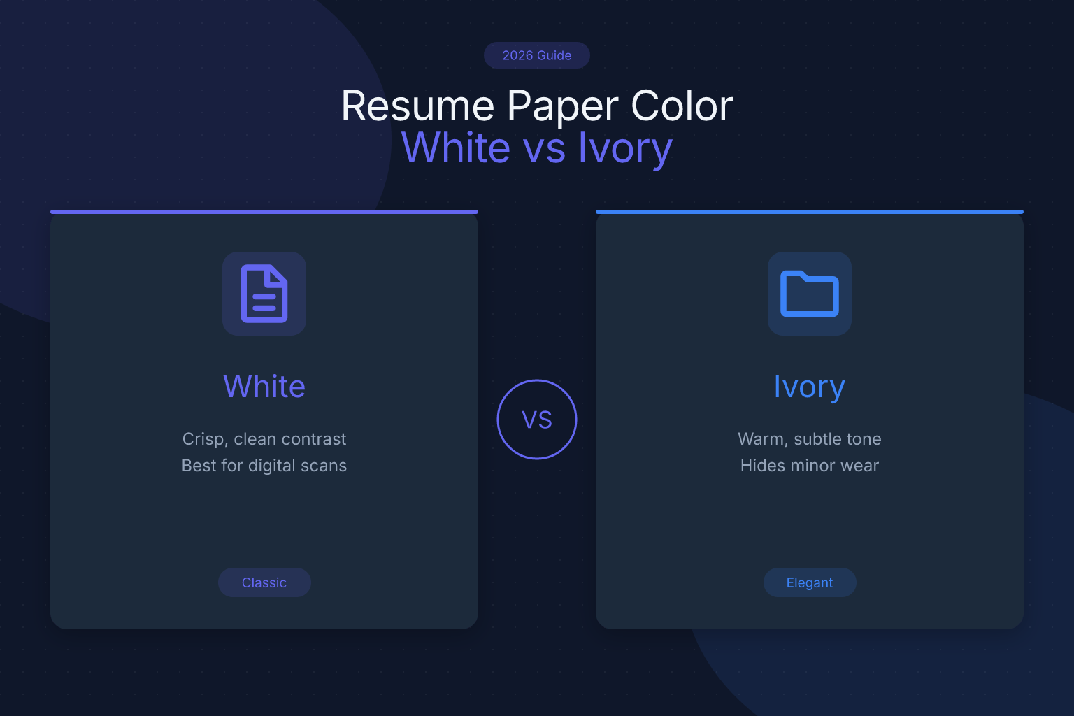
If you want a slightly warmer, more traditional look, ivory or cream is a close second. These off-white shades are still neutral and professional, but they add a subtle touch of elegance. Many job seekers in law, finance, and academia prefer ivory because it feels classic without being distracting.
What about other colors? In almost every case, the answer is no. Colored paper — even a light pastel — draws attention for the wrong reason. It can make your resume look like a flyer or a craft project rather than a professional document. Stick with white or off-white, and let your content do the talking.
Why Paper Color Matters More Than You Think
You might think paper color is a minor detail, but it affects three things: first impressions, readability, and how well your resume reproduces.
First impressions. When you hand someone a printed resume, the paper is part of the physical experience. A crisp white or ivory sheet feels intentional and professional. A bright blue or pink sheet can make the same content feel less serious — even if your qualifications are identical.
Readability. Black text on white paper has the highest possible contrast. That means a hiring manager can scan your resume quickly without straining. Colored paper reduces contrast, especially under fluorescent office lights or in a dim conference room.
Reproduction. Many employers photocopy or scan printed resumes before sharing them with a hiring committee. White paper reproduces cleanly every time. Colored paper often turns gray, muddy, or uneven when copied, which can make your text harder to read and your resume look sloppy.
In short, paper color is one of the few physical details you fully control. Choosing white or ivory removes a variable that could otherwise work against you.
White vs. Off-White: How to Choose
If you’ve narrowed it down to white or off-white, here’s how to decide.
Bright white. This is the most common choice and works for nearly every industry. It has a clean, modern look and pairs well with black or dark gray text. If you’re applying to tech, healthcare, retail, or any corporate role, bright white is a safe default.
Natural white. Slightly warmer than bright white, natural white has a softer tone without looking yellow. It’s a good middle ground if you want a touch of warmth but still want maximum contrast.
Ivory or cream. These shades are warmer and more traditional. They can look elegant for conservative fields like law, finance, or academia. However, avoid anything too yellow or beige — it can look dated or dingy.
How to choose: If you’re unsure, choose white. It’s never wrong. If you want a slightly more distinctive feel and you’re in a traditional industry, ivory or cream is fine. Avoid gray, tan, or any shade that makes black text look washed out.
Paper Colors to Avoid (and Why)
Here are the paper colors to skip, along with the reason each one hurts your resume.
- Pastel pink, blue, green, or yellow. These look unprofessional and can make your resume feel like a party invitation. They also reduce contrast and may not photocopy well.
- Bright or neon colors. These are distracting and can make you look like you’re trying too hard to stand out. Hiring managers want to read your qualifications, not squint at a neon sheet.
- Gray or dark paper. Gray reduces contrast with black ink, making text harder to read. Dark paper requires white or light ink, which is expensive, uncommon, and often looks gimmicky.
- Patterned or textured paper with heavy designs. Patterns interfere with text and can make your resume look cluttered. A subtle linen or laid texture is fine, but avoid anything with visible fibers, speckles, or borders.
The rule is simple: if the paper color is noticeable before the content, it’s the wrong color.
Paper Weight, Texture, and Finish: The Full Spec
Color isn’t the only physical detail that matters. Here’s what to look for in resume paper.
Weight. Standard copy paper is 20 lb, which feels thin and flimsy. For a resume, use 24 lb or 32 lb paper. 24 lb is a solid everyday choice; 32 lb feels noticeably more substantial and is often sold as ‘resume paper.’ Heavier paper also resists bleed-through if you’re printing double-sided.
Texture. Smooth paper is the safest because it doesn’t interfere with text. A subtle linen or laid texture can add a touch of class, but avoid heavy textures that make letters look uneven. If you’re using a textured paper, print a test page first to make sure your font is still crisp. For font choices that stay readable on any paper, see our guide to the best resume fonts for ATS readability.
Finish. Choose matte, not glossy. Glossy paper reflects light and can make text hard to read under office lighting. Matte paper looks professional and scans well.
Size. In the U.S., use standard 8.5 x 11 inch paper. In most other countries, use A4. Don’t use odd sizes or cardstock that’s too thick to fold or fit in a standard folder.
When You Might Consider a Subtle Tint (and When Not To)
Some job seekers wonder if a very light gray or pale blue paper is acceptable for creative roles. The short answer: it’s almost never worth the risk.
Even in creative fields like design, marketing, or media, the paper itself should stay neutral. If you want to show personality, do it through your resume’s layout, typography, or a digital portfolio — not through colored paper. A graphic designer’s resume printed on white paper with a clean, well-designed layout will always look more professional than one printed on pastel blue.
The only time a subtle tint might be acceptable is if you’re handing out resumes at a creative networking event where unconventional materials are the norm. But even then, white or ivory is still the safer choice. When in doubt, let your work speak, not your paper.
How to Print Your Resume So It Looks Professional
Once you’ve chosen the right paper, follow these steps to get a clean, professional print.
- Build a clean resume first. Use ResumeMate’s free resume builder to create a single-column, ATS-friendly resume and export it as a PDF. A clean digital file translates to a clean print. Not sure which template fits your industry? Our guide to choosing the best resume builder template can help.
- Use a quality printer. If you’re printing at home, set your printer to its highest quality setting and use fresh black ink. If you don’t have a good printer, use a local print shop or office supply store.
- Print a test page. Before printing multiple copies, print one page and check for smudges, alignment issues, and contrast. Hold it under different lighting to make sure the text is easy to read.
- Print single-sided. Unless you have a two-page resume and the employer specifically asks for double-sided, print single-sided to avoid bleed-through and make it easier to review.
- Store and transport carefully. Keep printed resumes in a folder or portfolio so they don’t get bent, wrinkled, or stained. A crisp resume makes a better impression than a crumpled one.
If you want to make sure your resume content is as strong as your paper choice, run it through the ResumeMate score checker before you print. It flags formatting and content issues that could hurt your chances.
Digital Resumes: Color Rules Are Different
If you’re applying online — which is how most applications happen in 2026 — paper color doesn’t apply at all. Instead, the ‘color’ of your resume is determined by its digital design.
For digital resumes, the background should be white or a very light neutral, and the text should be dark. You can use a subtle accent color for headings, lines, or your name, but keep it minimal. Too much color can make your resume look busy and can reduce readability on screen.
The rules for digital color are different from paper, so don’t assume what works in print works on screen. For a full breakdown of which colors to use in a digital resume, read our guide to the best resume color schemes for professional jobs.
One more thing: if you’re emailing your resume as a PDF, the recipient will see it on a screen, not on paper. That means your focus should be on clean formatting, ATS compatibility, and a professional color scheme — not on the paper you’d print it on.
FAQ
Q: What is the best color for resume paper?
A: The best color for resume paper is white. It offers the highest contrast with black ink, looks professional, and reproduces cleanly when photocopied or scanned. Off-white shades like ivory or cream are also acceptable if you want a slightly warmer look.
Q: What color should resume paper be for a professional job?
A: For a professional job, use white or ivory paper. These neutral colors signal professionalism and keep the focus on your qualifications. Avoid pastel, bright, or dark colors, which can make your resume look less serious.
Q: Should you use color on a resume?
A: On paper, no. Colored paper reduces readability and can look unprofessional. On a digital resume, you can use a subtle accent color for headings or lines, but the background should stay white or very light, and the text should remain dark.
Q: Is ivory or white better for resume paper?
A: White is the safest choice because it works for every industry and provides maximum contrast. Ivory is a close second and can feel more traditional, which some people prefer for law, finance, or academia. If you’re unsure, choose white.
Q: Can I use colored paper for a creative resume?
A: It’s almost never a good idea, even for creative roles. Show your creativity through your resume’s layout, typography, or portfolio, not through colored paper. White or ivory paper with a well-designed resume will always look more professional.
Q: What weight of paper is best for a resume?
A: Use 24 lb or 32 lb paper. Standard 20 lb copy paper feels thin and flimsy, while 24–32 lb paper feels substantial and resists bleed-through. 32 lb is often sold specifically as resume paper.
Q: Does resume paper color matter for ATS?
A: No. Applicant tracking systems parse digital resumes, not physical paper. Paper color only matters when you’re printing a resume to hand to someone in person. For online applications, focus on a clean digital format and ATS-friendly design.
Track Every Application While You Job Hunt
Stop losing track of where you’ve applied. The ResumeMate Job Tracker is a free Chrome extension that tracks every application, deadline, and follow-up in one place — right from your browser.